Project Overview
The brief
Design a website where potential customers can see what the company offers. Once a user lands on the website through social media ads or via a web search the primary call to action of the website would be to get them to sign up for a trail class at a branch near them.
Project duration
3 weeks
Team
2 graphic designers, 1 web developer, 1 UI/UX designer (me)
Why Redesign?
Knockout had just started advertising on Facebook and Instagram a few months ago and they had a decent click-through rate of around 1% (which is above average) but their conversion rate was around 8% while the average for the fitness industry is 14%, so they wanted to make changes to their website so that they could get more conversions via their website.
Design Process

Objectives and Goals
Business Goals
- Get more conversions from Facebook & Instagram ads
- Get more people to register on their website
- Build a strong online presence
Project goals
- Direct people to the registration page while giving them all the necessary information
- Improve the overall experience of the website
User Research
To understand young adults' motivation to join an MMA gym along with their fitness goals and difficulties, we interviewed users in the age range of 20-28 years living in various areas of Delhi NCR.
People Serveyed
17
Pro Athletes
5
College Students
2
Professionals
10
Knockout's primary customers were people who were looking to excel at MMA but we also interviewed people who were just looking to get in shape to get a better understanding of what customers were looking for.
User Persona
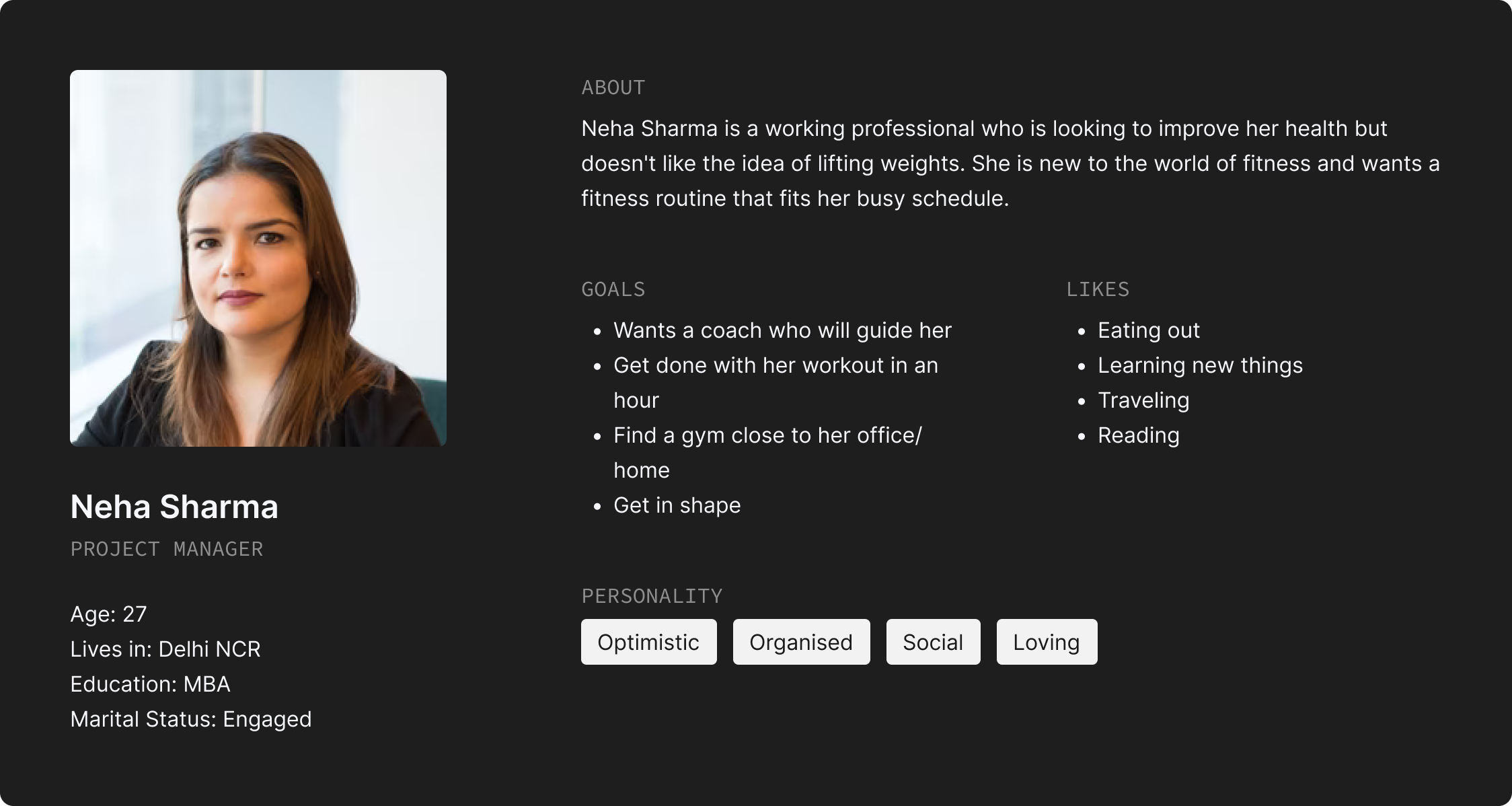

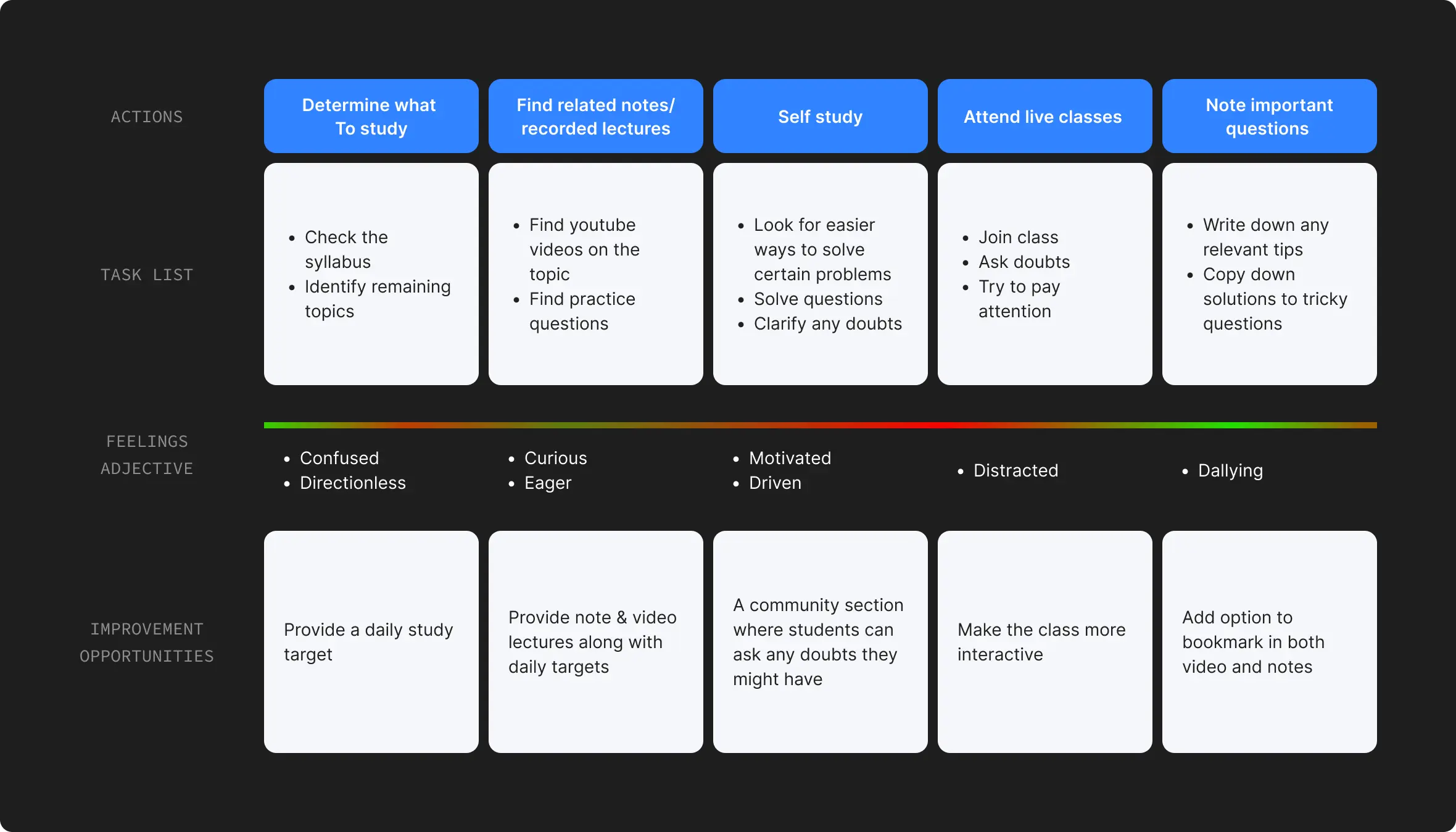
User Journey

Anuj Yadav
College Student
Goals
Join a MMA gym near him and start training so that he can get better at the sport and participate in local tournaments in the near future.
SCENARIO
Anuj is home after college and is scrolling through social media applications to look at what all his friends are up to.
Insights
- Customers that joined strictly for fitness choose MMA over traditional gyms because:
• “Traditional gyms are boring”
• “I don't want to become muscular”
• “I don't like lifting weights”
• “I wanted to learn how to defend myself” - Most of knockouts current customers were walk-in customers.
- One fear people who hadn't joined any gym yet was that they might get injured.
- A majority of the customers checked knockouts and their competitor's websites before joining.
- 91% of people who take a trial class join Knockout.
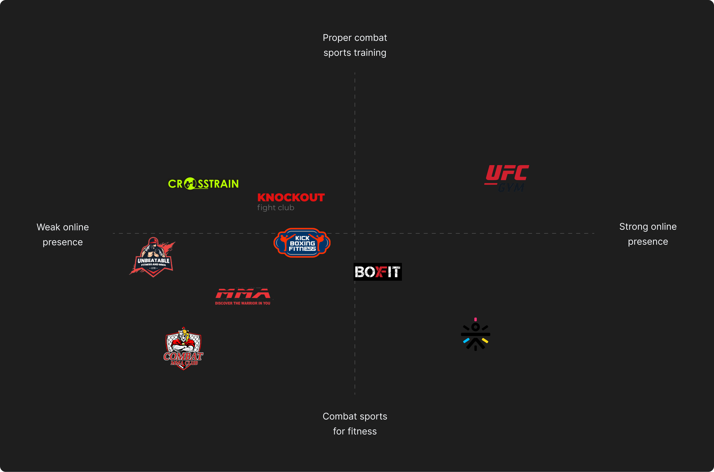
- Having a good website experience will be a great way to stand out among competition as very few competitors have a good website.
- Customers who were serious about MMA and wanted to participate in tournaments spent more than 2 hrs in the gym and were willing to travel to the gym.
Website Pain Points
- Pages are not synchronized i.e. font and colour are different on different pages.
- Images are blurred & low-quality.
- Doesn't have a clear call to action.
- Has too much Irrelevant text.
- Quite a few blank pages.
- The registration form doesn't have a separate page.
- All social media ads send customers to the homepage.
Competitor Analysis
How Might We
- HMW make the landing page attractive to first-time visitors.
- HMW add SEO elements without it looking like spam text.
- HMW showcase the brand's identity through the website.
- HMW incentivise new customers to register.
- HMW make it quick and easy for customers to register.
User Flow
The idea is to sperate users based on the imformation they already have about Knockout. People who come to the website via social media ads already know a little about what knockout does because the ad creatives tell them about us wheras people coming via a search engine might not know anything about the company. So we decided to send all the traffic coming from social media directly to the signup page and everyone else to the home page.

Wireframes

Style Guide
We decided to keep the overall website appearance on the darker side with red being the primary colour as it fits Knockout Fight Clubs identity

Final Design
Landing Page

Desktop/LAPTOP screens
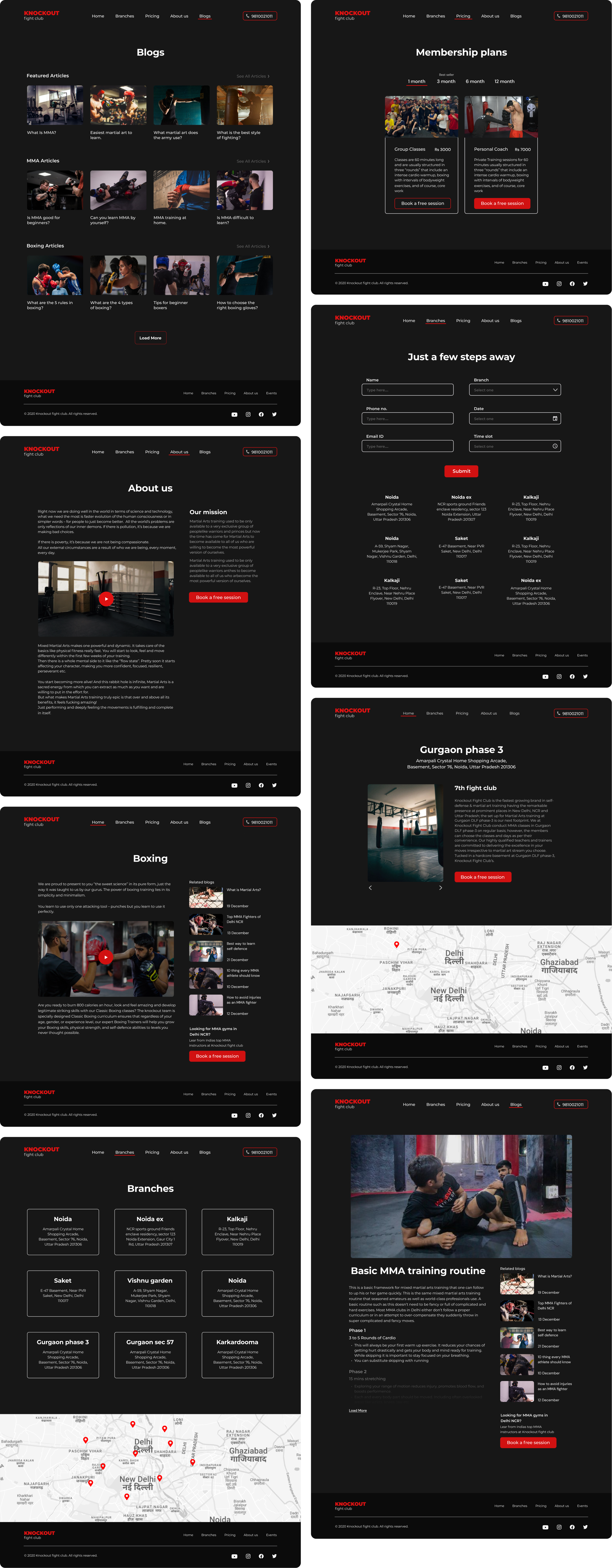
Mobile screens

Accessibility Considerations
- Every major element of the app has a minimum contrast ratio of 6:1
Normal text
AA
Large text
AA
AAA
Takeaways
What I learned
While working on this project i got to learn a lot about digital advertising practices, working with experienced digital marketers taught me quite a few things about Facebook, Instagram, & Google advertising which im sure will help me in my future endeavours.
Next step
I would like to see the change in conversion that happens from all future social media as well as search engine ad campaings and make changes to the website accordingly.

