Project Overview
My actual work at Osfin.ai is under NDA, I've used my learnings to make this case study
The brief
Improve the usability and overall look of the existing data tables (the data table should according to "US and European market standards")
The goal
Recognise issues current users have while using the data table and device a solution aiming to solve these issues
What is the data table used for?
The primary purpose of the data table is to filter and view the desired transactions, additionally the user should see all the transactions that require immediate attention upfront so that they can take action accordingly. The possible actions that can be taken on individual transactions differ based on the module, transaction type, client requirements, etc.
Constraints
The team was small and the turnaround time had to be quick (we were on the startup timeline)
Why redesign?
The company is growing at a fast pace and is trying to attract bigger clients, for which we need to be at look and feel like the tools these big companies use.
Project duration
2 weeks
My role
UI/UX designer
Design Process

Objectives and Goals
Business Goals
- Being a seed stage startup they want to grow as fast as possible
- Get US and European clients
- Build a DIY (Do It Yourself) product, where the client can insert files and get desired results
Project goals
- Design a data table that is easy to use and can show a large amount of data
- Users should be able to apply relevant filters and see the data they want to
User Research
I along with the product manager conducted user research on 8 people that use our platform on a daily basis and fit our target demographic(mentioned below). We decided that this would be a good starting point to understand the issues our users face while interacting with our product(specifically the data table)
Who were the participants?
The participants were employees of our company from the implementation team, their job is to convert our client's data using suitable software and process the data to get the desired output. These are the people who have the most experience using our software and going further we plan to make this process DIY so that the clients can do it themselves.
User Demographic
Age Group
Typically in the 21-25 age range, representing recent graduates.
Education background
Recent graduates from tier 3 or below engineering colleges, indicating that they may have received their education from institutions that are not considered top-tier or prestigious. This demographic may include individuals who worked hard to excel in their studies and are now looking to establish themselves in the software development field.
Professional experience
Entry-level software developers with limited work experience, possibly in their first or second job after graduation.
Technical Skills
Proficient in SQL (Structured Query Language). They have a good understanding of SQL, which suggests they may have had SQL coursework during their education or have picked it up through self-learning.
Career aspirations
As low-level coders, their career goals may include gaining more experience, improving their coding skills, and potentially moving up the career ladder in the software development field.
Tech Usage
They are likely to be familiar with coding tools, software development environments, and SQL database management tools.
Old Data Table
Pain Points
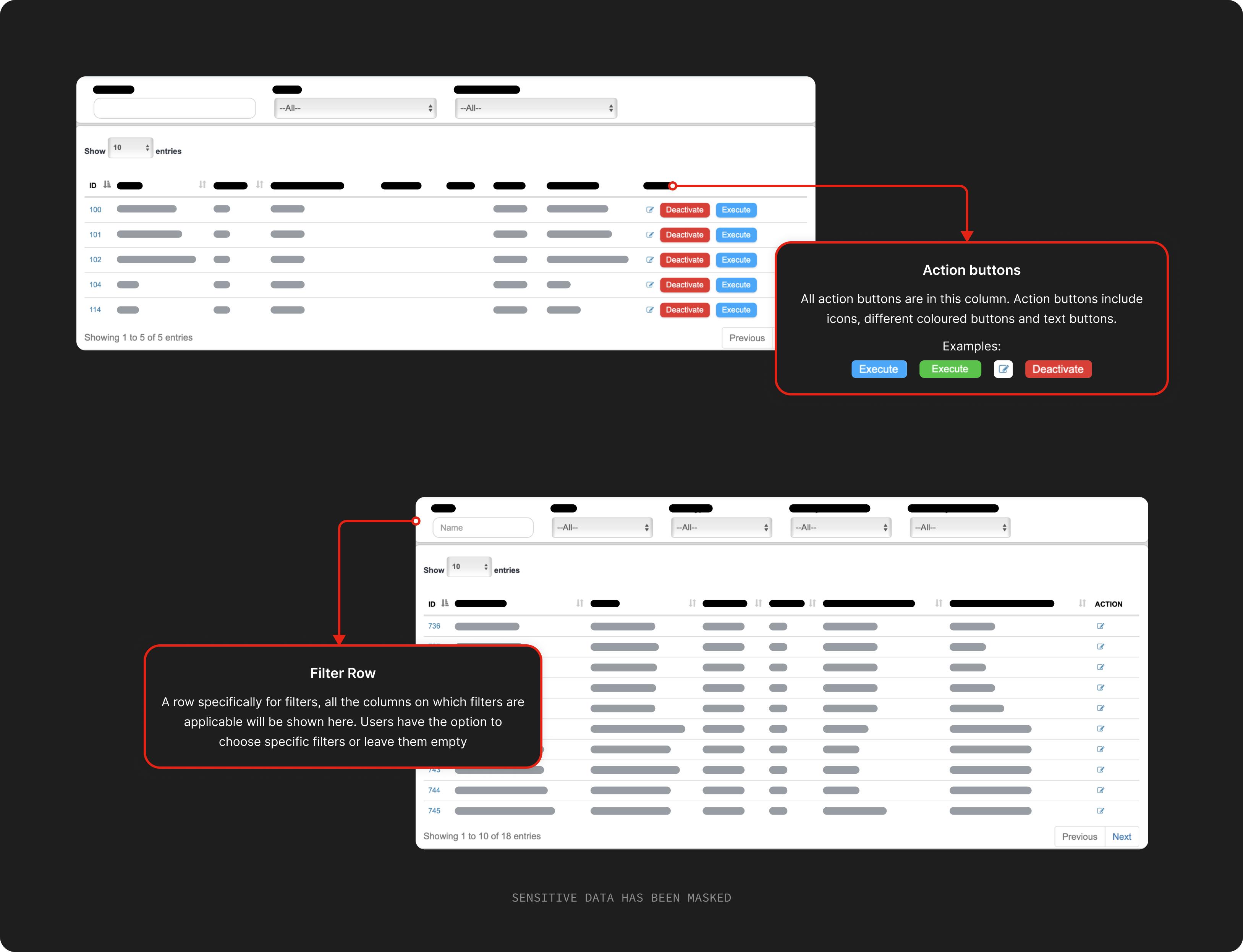
- The filter row takes up a lot of real estate. The data is the most imortant information on each page and the filter block plus the top navigation of the product forces the table to show less information than it could've
- User couldnot choose multiple values while applying filters to a column i.e. it wasnt possible to choose value 1 and value 2 in a filter at once, they had to choose value 1 see the data and change the filter to value 2
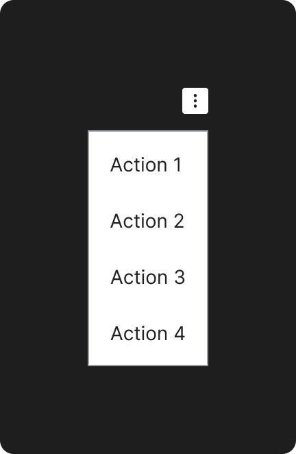
- The action column has too many different types of CTAs (buttons, icons, text buttons)
- If there are too many columns in the table the action column stays to the extreme right and is not visible at first glance
- The user did not have the choice to choose which columns they want to see
- The width of a column was dynamic and depended on the width of the largest elemnet in the column, so even if one element is too long the width of the entier column adjusts to that element
- If search is applicable on any columns the filter row showed a separate search bar for each column but search was possible only on one column at a time.
MoSCoW
Must have
- Ability to filter data
- Data should be visible clearly
- Coloured tags (only one column in a table to avoid confusion)
- Ability to choose multiple elements while applying a filter
- Fixed actions column
Should have
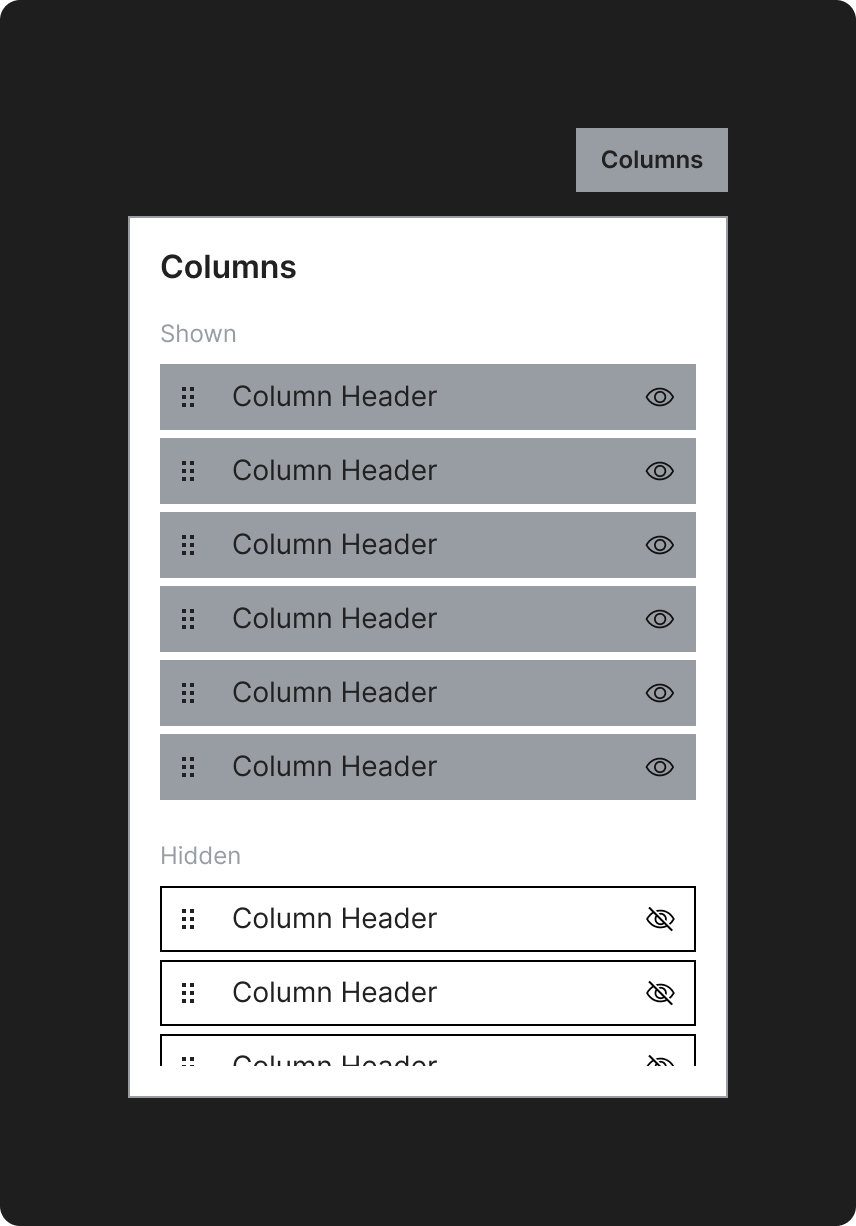
- Ability to choose and arrange columns
- Multiselect data and take action on a group of data at once
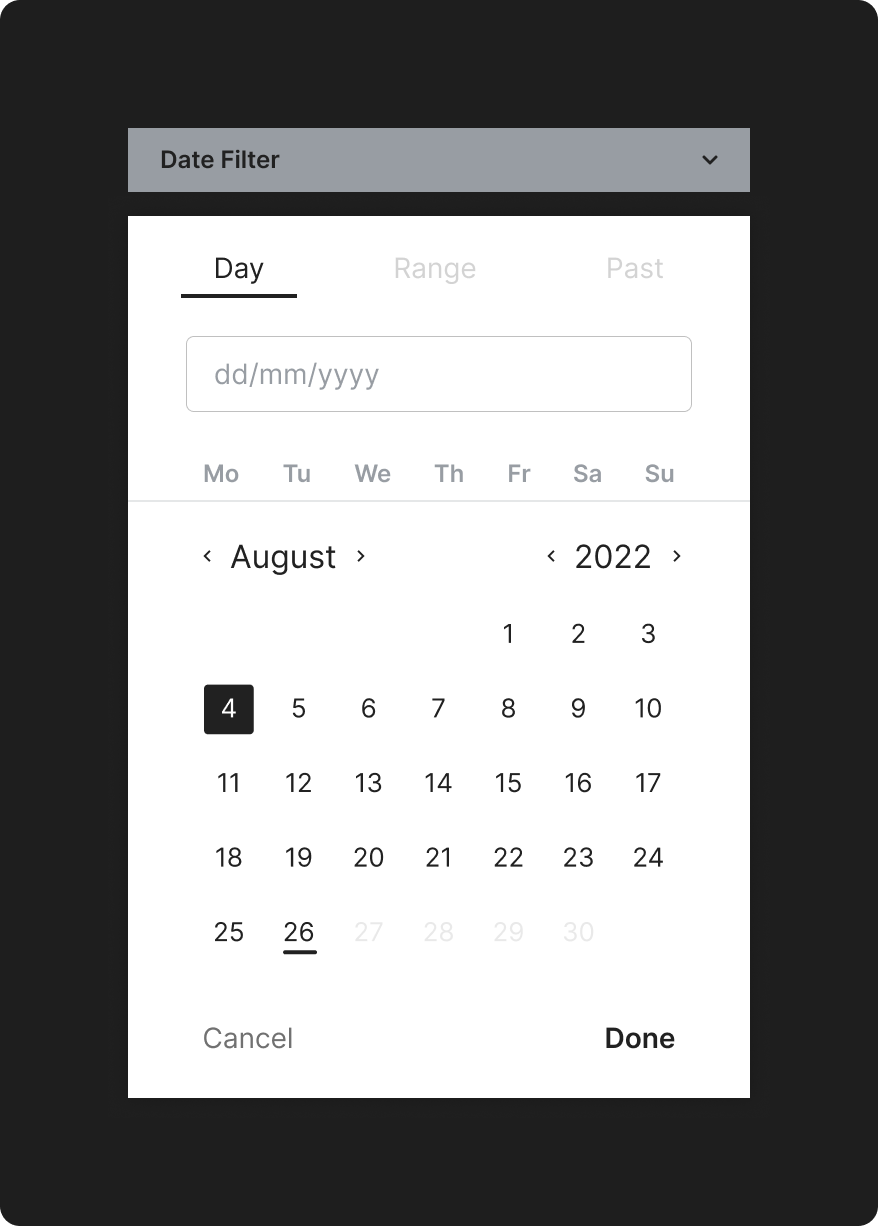
- Multiple types of date filters (date range, past X days, one day)
- Ability to clear all filters at once
Could have
- Additional information about the row in a seperate modal
- Customise and save a view for multiple users
- Tooltips and hover effects wherever neccessary
Won’t have
- Ability to search on multiple columns at the same time
- Ability to move or hide the actions columns
Wireframes

Filters

Date FIlter
Actions
Columns
1st User Testing Insights
- Filtering data was still a little annoying as filters were stacked one on top of the other, which was not the most user friendly
- What if the user wants to see all the elements in a column except 1, in the current wireframe he/she will have to individaually choose all the elements they want to see which takes a lot of time
- Applying multiple filters was difficult
- Knowing which filters are currently acting on the data table was not immediately visible
- All the other pain points we aimed to solve were resolved
Updated Wireframes

Updated Filters

The solution
Prototype
Visuals & interactions
Order history
Hide columns
Arrange columns
Filters
RoW selection
Usablity Study
I ran a test with 6 users in the target demographic using the prototype. Initially, the filters took a little getting used to by the team as they had been using the old design for quite a long time but after a while they realised that the new design helped them work faster.
After a couple of weeks of initially releasing the new design we also started to show certain filter column by default which further enhanced the user experience.
Takeaways
What I learned
Starting to design from the smallest component (including all the different states of these components i.e. hover state, clicked state, focused state, etc.) and involving all the stakeholders from the very beginning helps a lot of hassle in the later stages of the design process.
Next step
We decided to let the implementation team work with the new design for a couple of months and them revisit the design asking the team for any feedback they might have.

