The brief
Design an interactive and engaging mobile app for an online coaching institute to help students prepare for competitive exams.
The goal
Ideate and visualize engaging and interactive ways to enhance the online coaching experience for MBA entrance exams
Why does a coaching institute need a mobile app?
The start of the pandemic forced all of us to move our studies as well as work online which has made us realize the advantages of studying online which is why online education has become a major industry and this is the reason every coaching institute is working on building a mobile-friendly user experience.

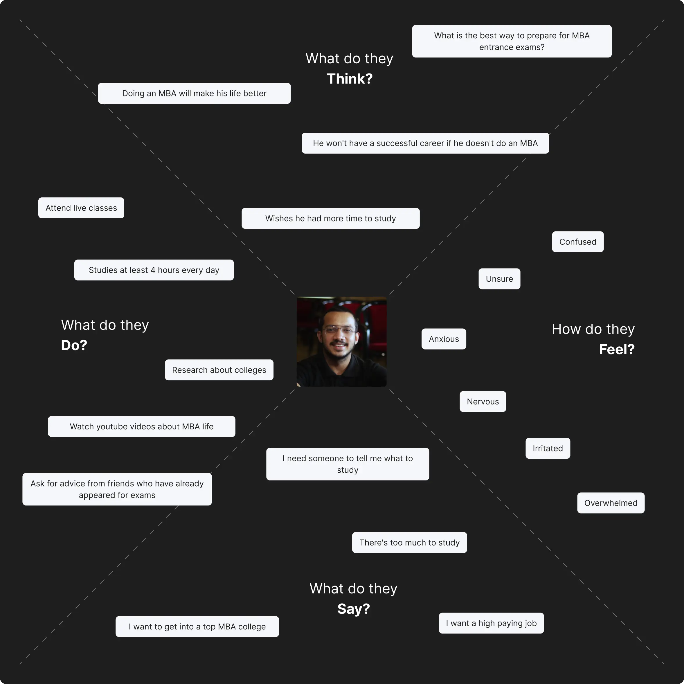
Foundational user research was carried out on 11 people between the age of 20 to 25, the goal of this research was to prioritize the users by putting them first. The interview was the main research method and was conducted to get more in-depth information.
72%
thought cracking MBA exams is tough
82%
thought online lectures need to be more interactive
64%
preferred taking online classes
82%
thought peer learning is important
91%
felt they need guidance asto what to study when
64%
studied for a minimum of 4 hrs every day
Goals
Manage college as well as prepare for MBA entrance exam so that gets a high enough score and has a financially successful career
SCENARIO
He woke up early to study for a few hours because he is going to be busy with college work for the rest of the day.

Problem Statement
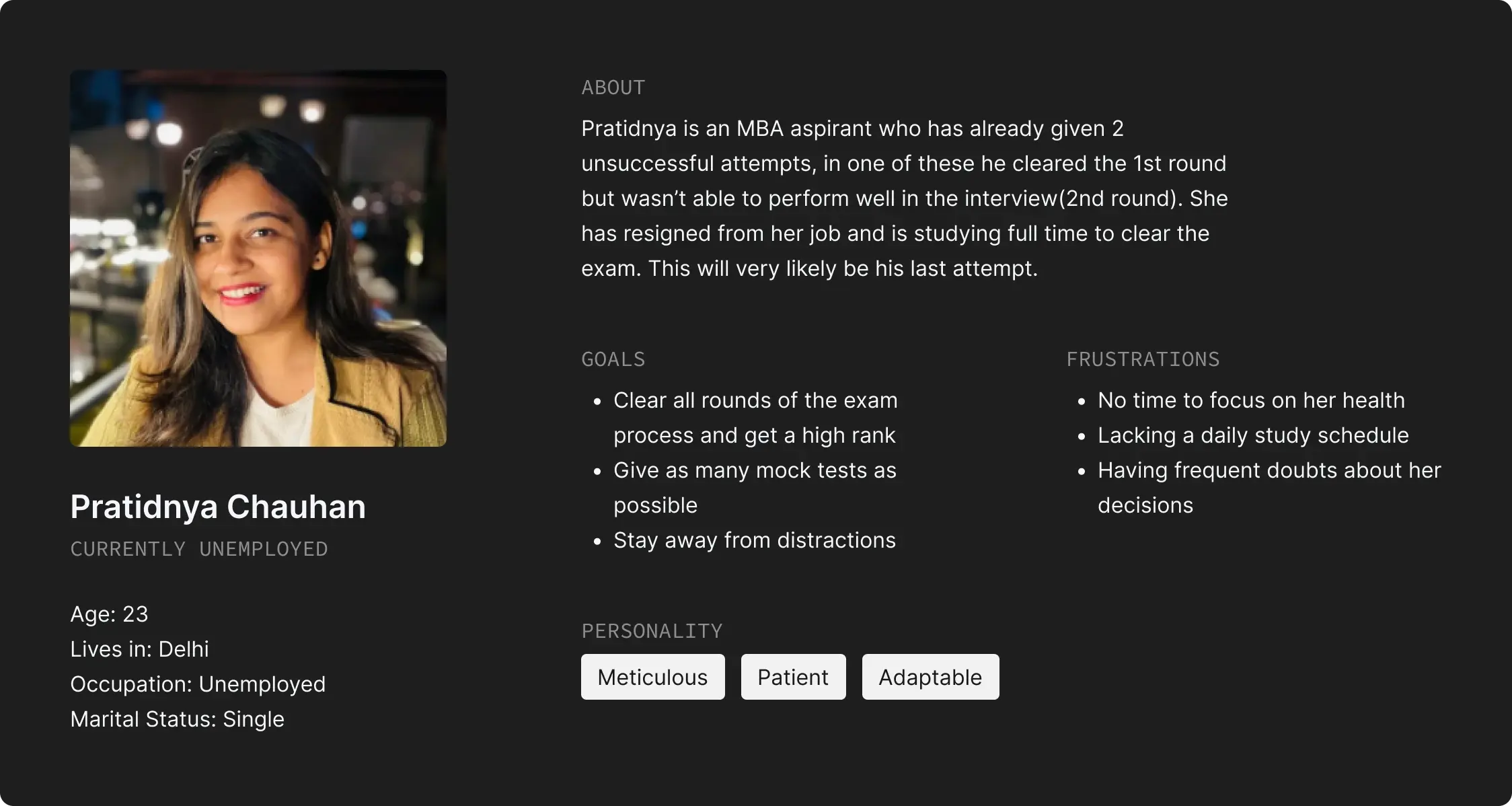
Akash is a college student
who wants a clear daily study target
because he doesn't want to spend time deciding what to study
- Doubts solving takes a lot of time and sometimes are not solved atall
- Typing your doubts takes too long and are sometimes hard to articulate in a text
- Classes tend to become one sided “lectures”
- Peer learning is almost 0
- Eye strain from constant screen use
- Unable to bookmark content like one would in physical books
- Studying online tends to become extremely monotonous and boring
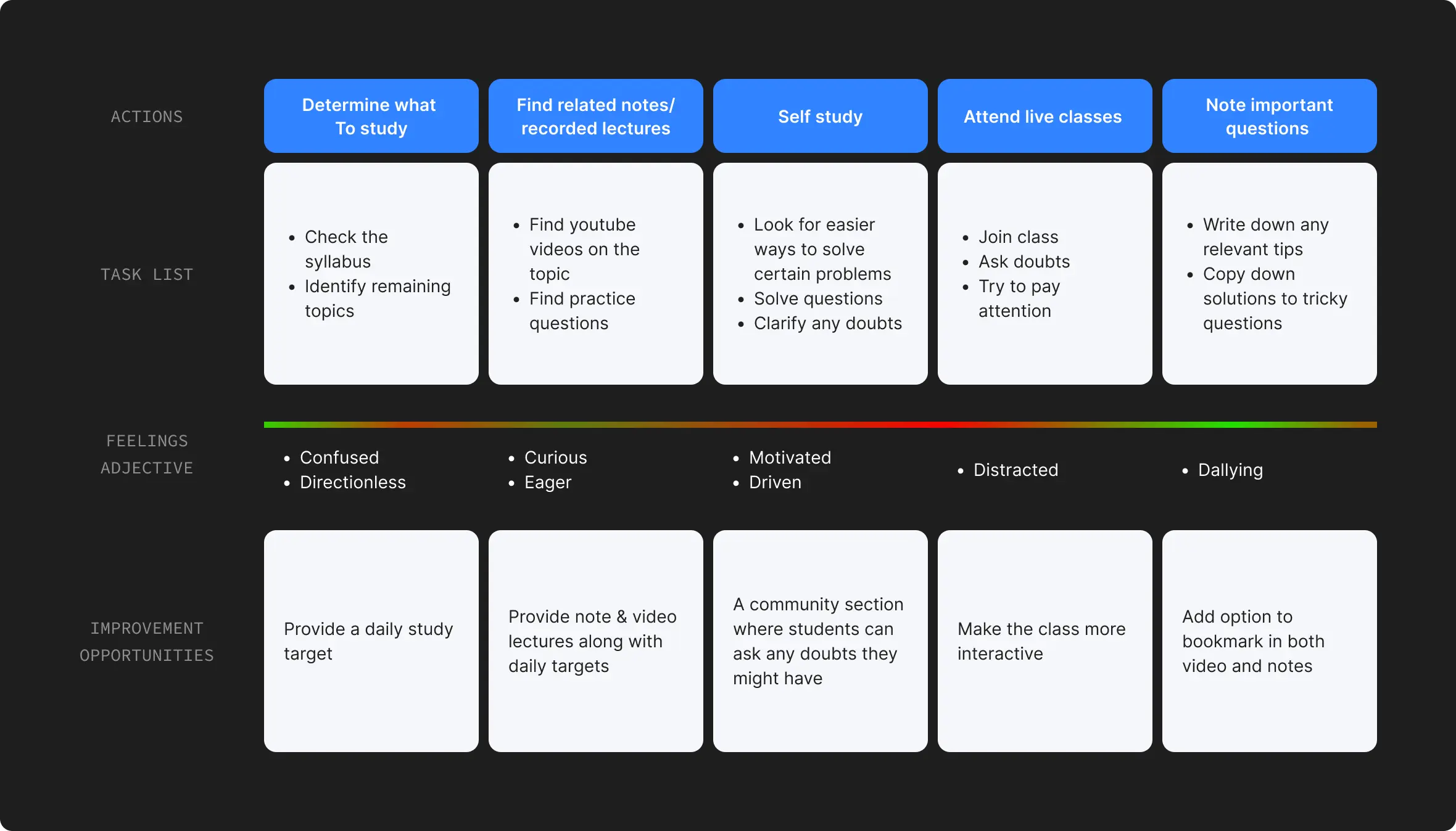
- Lack of direction i.e. not knowing what to study when apart from live classes
Must have
- Live classes
- Notes
- Recorded videos
- Previous year’s question papers
- Exam choices
- Community chat
- Doubt solving
Should have
- Daily targets
- Call-in feature during live classes
- Option to download recorded videos
- Option to bookmark questions and videos
Could have
- Live polls during classes
- Dark mode
- Show number of attendees during live classes
- Streaks to gamify studying
Won’t have
- 1 to 1 messaging
- Ability to choose daily targets
- Retake completed tests
Conducted a moderated open card sorting exercise with 3 participants who were currently preparing for MBA entrance exams. After sorting the cards into groups I also asked them to name the groups.

I made a wireframe prototype to test before moving to making high fidelity UI so that i can make any changes or additions that would help the target customer achieve their goals
Insights
- Once the users solve testes they should get tips on how to improve their score in that subject
- It should be easy to find the doubts you've asked in the community
- The users should be able to see their class schedule so that they can plan ahead.
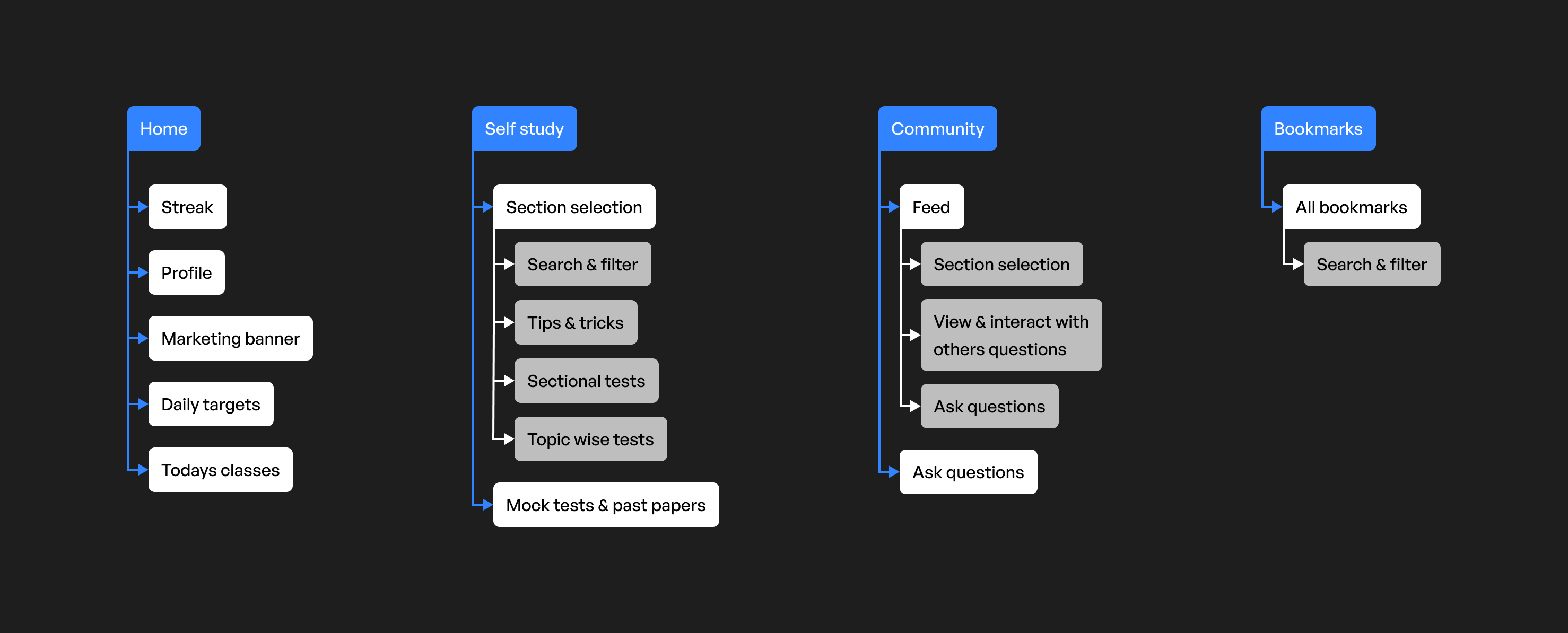
Once I tested the wireframe I made changes to the IA according to the insights gathered

Wireframes were updated to accomodate the changes in the information architecture
Class schedule view
Users can now swipe on the streak view on the top of the home page to view their entire class schedule

added a My posts tab
Added tabs on the top right of the community page where users can switch between their feed and the questions they have asked making it easier for users to find the questions they have asked

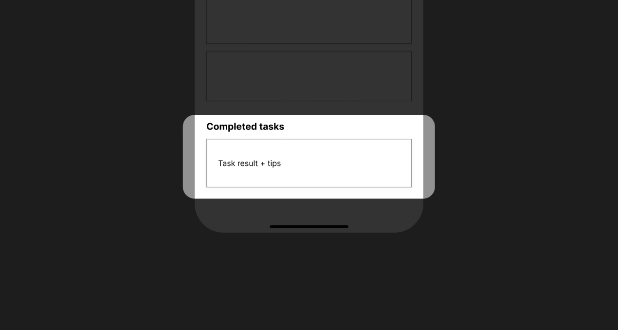
Completed task results & Tips
Once the users have completed a task they will see how they did on that task along with tips to improve so that they get better at that subject

Every major element of the app has a minimum contrast ratio of 6:1
Created a frame around small clickable elements to increase its click area
I ran a test with 4 users in the target demographic using the prototype.
- The design was well received by the participants, who found it simple to use.
- There were a few complaints and suggestions, which I will keep in mind for all my future work.
What I learned
I learned that making changes/additions to any design is much easier during the initial parts of the design process so before making high fidelity designs one should test the wireframe prototype on as many people as possible
Next step
Conduct another round of usability studies to know whether the pain points have been fully addressed and conduct more user research to know more areas of need


